Damnable Lying CDC
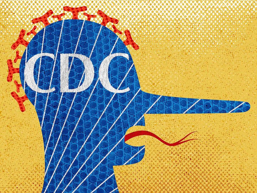
I must say I am extremely angry at the political machine that I USED TO BELIEVE was a institution of science and something you could have faith in.... the U.S. Center for Disease Control (CDC).
This is the article, in Fortune, that shocked me into the realization that the CDC is just a corrupt and politically driven institution as any we have seen in our "fair" nation:

Some important quotes from the article:
"The U.S. is experiencing a sixth wave of COVID, with over 90,000 confirmed new cases a day and a 20% increase in hospitalizations over the past two weeks. The actual number of new cases per day likely sits at a half million or more, "far greater than any of the U.S. prior waves, except Omicron," writes Dr. Eric Topol, the executive vice president of Scripps Research and a professor of molecular medicine, in a post on the maps.
Meanwhile, the CDC propagates delusional thinking that community levels are very low while the real and important data convey that transmission is very high throughout most of the country. Not only does this further beget cases by instilling false confidence, but it is conveniently feeding the myth that the pandemic is over—precisely what everyone wants to believe."
We are in the midst of a sixth wave of this damnable pathogen, and there is no guidance of any merit from the agency we are SUPPOSED to be able to count on to give us the information to try to live as safely as possible.
With these numbers as reported by the SECOND GRAPH, we SHOULD be masking in all enclosed spaces. We should be very vigilant about our safety protocols in the workplace. Our national, state, and local governments should be reinstating mask mandates. But.... NO ONE IS DOING A DAMN THING. A lot of folks think everything is FINE AND GOOD because the widely published map (Graph 1) shows everything is GREAT, everything is FINE. And, I suspect.... both damn political parties WANT IT THAT WAY because this is an "important" mid-term election year, and they both are vying to try to wrangle more power..... and who the hell cares if there are more Covid-19 deaths or more debilitating Covid-19 disease?
I am so angry and frustrated. I will never trust the CDC again, and I despise both political parties.
PipeTobacco


4 Comments:
And these are the same people who tell us that pipe smoking and cigarette smoking are essentially equally hazardous and are more injurious than marijuana smoking.
It's politics, kind Professor!
we wouldn't have this problem if people would get vaccinated.
That is shocking and depressing.
It is so depressing but it's the reality we have to deal with. I trust the numbers from my county's health department, mask indoors and have been double boosted. Will it be enough? I don't know.
Post a Comment
Subscribe to Post Comments [Atom]
<< Home